If you'll recall, many months back I posted about a Design Dilemma idea I had for my friend, Jana. Jana, her hubster Ray, and their two French Bulldogs share a precious home in Dallas. Jana is very inspired by Jonathan Adler's happy, crisp style, and wanted to bring that feel to their sitting room, and adjoining dining room.
I took my cues from Adler's generous use of white to balance pure fresh colors, and made some suggestions for paint, fabric and art, but Jana did all the heavy lifting. Over the course of several months and emails, we commiserated on the best way to use the side chairs she already owned and loved, as well as some other Craigs and Round Top (antique fair) pieces she picked up. I'd say Jana's a genius at using what she's got to create a look coherent with her hopes, but you go ahead and see for yourselves!
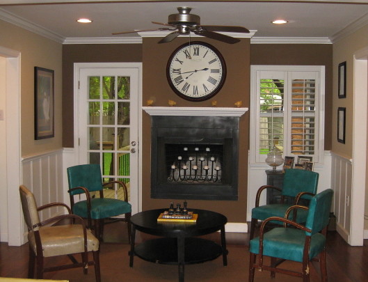
Before: Sitting Room
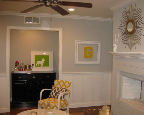
After: Light Gray paint, large doses of yellow and white, and you've got one totally opened-up space!
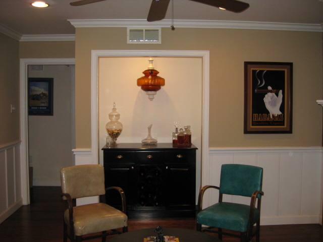
Before: Ray's Bar/Nook - When Jana first began brewing ideas for the room, her husband told her the bar area was "hands off."
After: She was able to keep that promise, while still spiffing it up. Love the frenchie silhouette!
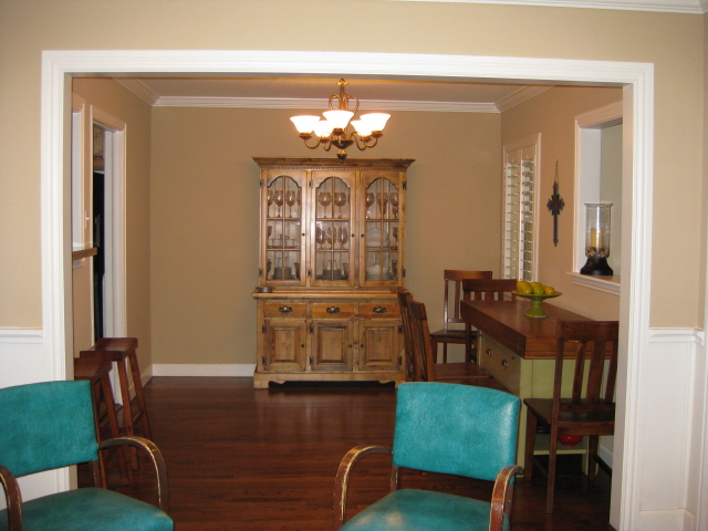
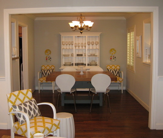
Before: The Dining Room - The open-concept home allows for the sitting room to flow into the dining, so it only made sense to connect the two visually. I suggested she carry-through with the wall color, paint the hutch and center the table so as to truly function as a dining room.
After: She did just that and more: juxtaposing simple, modern chairs against the industrial table was a stroke of genius. It's a tough call, but I think this area is my favorite!
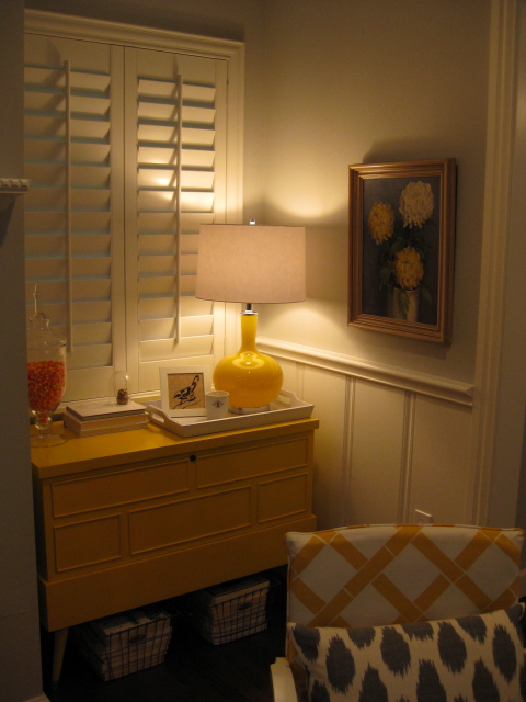
The Corner nook in the sitting room. The small, mid-century sideboard hits the spot!
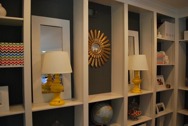
Entryway: Jana and Ray have built-ins in their main living area, and they did a great job tying them into the design. Major kudos for the nice styling, too!


