It's been way too long since Ben and I sat down for a He Said, She Said post. Just letting you know, we were drinking and blogging...
If I had to classify my taste these days, I'd probably put myself in the "eclectic" column. More and more, I appreciate reconditioned or repurposed, quality over quantity, collected, with a touch of the unexpected. Easier said than done, for sure.
I tried to pull together a few images of rooms shunning the "matchy-matchy" look to see what Ben had to offer...
Me: First room. What d'ya think?
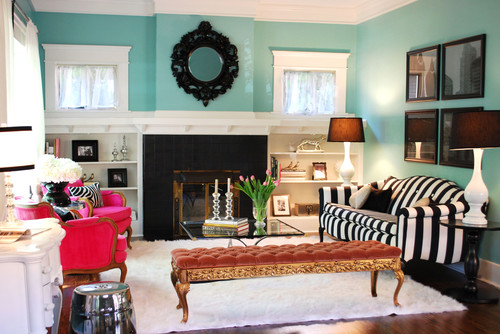
Ben: Well, the layout of the room reminds me of our first house in The Heights in Houston. Fireplace saddled by built-ins and windows.
Me: Yeah, this is probably a Craftsman.
Ben: Is that a dog bowl?
Me: No. It's a Chinese Garden Stool.
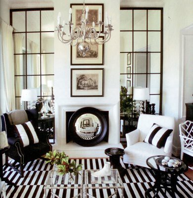
Me: Maybe, but the tall, mullioned ones make me tingle.
Ben: I thought this was a G-rated post?
Me: OK, wrap up the first room. Like it?
Ben: Yes, but I think a lot of people will hit their shins on that low bench thing, probably spill their red wine on that white rug.
Me: Yeah, this is probably a Craftsman.
Ben: Is that a dog bowl?
Me: No. It's a Chinese Garden Stool.
Ben: I don't understand those round mirrors. A mirror is of no use in that placement. You certainly can't see yourself in it, it doesn't reflect light or make the room seem larger. Don't get it, and don't like it.
Ben: That's just dumb.Me: Maybe, but the tall, mullioned ones make me tingle.
Ben: I thought this was a G-rated post?
Me: OK, wrap up the first room. Like it?
Ben: Yes, but I think a lot of people will hit their shins on that low bench thing, probably spill their red wine on that white rug.
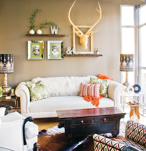
Me: I like the room, but I don't like the art arrangement - reads too "crafty" to me.
Ben: Is the theme of this post white, shaggy things? There was a white shaggy rug in the first pic, too. There's a lot of dead animal references in this room. Furry throw, deer skull, hide rug.... I agree with you on the art. One, great piece of art would've been better.
Me: This is more of a "real" home - it's not one that's been professionally styled for a magazine, so I like the attainability.
Ben: It's cozy. I could make it work.
Me: This is more of a "real" home - it's not one that's been professionally styled for a magazine, so I like the attainability.
Ben: It's cozy. I could make it work.
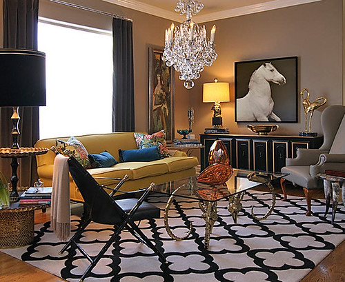
Me: I'm not sure why I included this picture. It's not eclectic - it's high glam.
Ben: Probably because it has another animal with white fur in it. We don't have any white fur in our house. We're such losers.
Me: OK, so forget the "eclectic" theme - what about this space - Yea or Nay?
Ben: Naaaay....just like the horse. Gray chair is hideous. Black chair looks like it puts you in a "seeing the dentist" position. And what is it with dead animal stuff these days? Horn leg and ram horn tables. Too many hard edges.
Me: These people do not have kids. Most likely, they are Todd and Margot (I don't knoooow, Margot!)
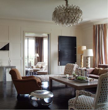
Me: This room is by an Italian designer, but I can't recall who.
Ben: This just doesn't look like much to me.
Me: Chandy is pretty amazing.
Ben: Too much brown, with too much black. And what's up with the chaise lounge in the mix? Everyone's sitting around talking, and lounger person says, "Hey, I'm just gonna take a little snooze." Why would you need two lamps that close together, too?
Me: I think they were trying not to overdo it with furniture, because the space itself is so badass.
Ben: No dead animals. I'm not inspired.
...and after that, the wine won out.


