When I did my first run-through of the latest issue of design e-zine, Lonny, I was almost breathless. Each page seemed to be better than the one before.
However, not wanting to be the Happy Clapper* type who can't offer a fair critique, I thought it best to call in my better half, to provide the year's first He Said, She Said: The Latest Lonny.
Me: Ben, you're first on deck (pass a piece of chocolate, too)
However, not wanting to be the Happy Clapper* type who can't offer a fair critique, I thought it best to call in my better half, to provide the year's first He Said, She Said: The Latest Lonny.
Me: Ben, you're first on deck (pass a piece of chocolate, too)
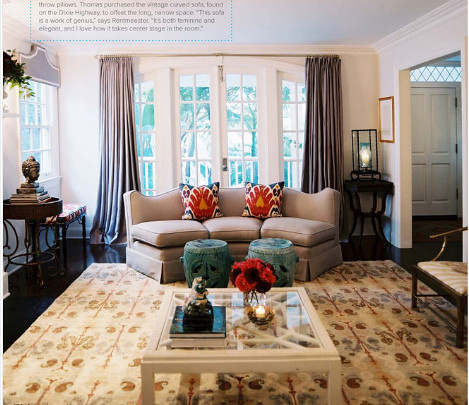
Ben: The only thing I don't understand is the purpose of that thing over the window on the left. It looks like Captain Crunch's hat.
Me: It's a pelmet. Remember, we made one for Avery's room?
Ben: And the couch, it's strange. Three people sitting on that couch would mean all of their knees touching. I think anyone walking into this room sees that couch and says, "I'm not sitting there, I'm heading for the wishbone chair."
Me: It's a pelmet. Remember, we made one for Avery's room?
Ben: And the couch, it's strange. Three people sitting on that couch would mean all of their knees touching. I think anyone walking into this room sees that couch and says, "I'm not sitting there, I'm heading for the wishbone chair."
Me: Well, I really love this room, including the strangely-angled sofa. I'm honestly having a hard time getting past those glorious curtains, though. I'm having a curtain obsession these days.
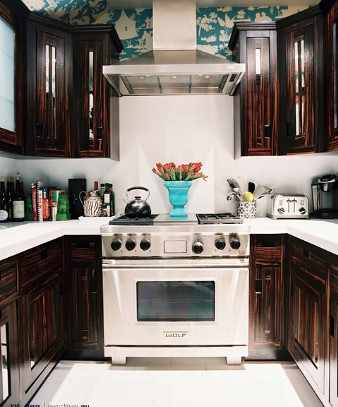
Me: Superb. And I don't normally favor dark-cabinet kitchens this much, but that touch of Quadrille wallpaper is a stroke of genius.
Ben: I'm not sure I would've gone with such a stark white backsplash behind the stove - seems to beg for splatters. I think at first, those dark cabinets would seem cool, but after awhile, they'd drive you freakin' nuts.
Me: They'd drive ME nuts, or just whoever?
Ben: Whoever had to cook in that kitchen every day.
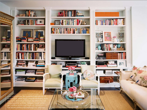
Me: It's bookshelves, I know. I just think this is a great example of perfectly non-perfect bookshelves. Not as overly-styled as you typically see in design publications.
Ben: What? This is VERY styled. Just because it's messy doesn't mean it's not styled.
Me: I don't see it as messy at all, but I give you that it probably DID take more effort than you'd assume to look this "unstyled."
Ben: Now I know what we can do with our spare chairs - face them AWAY from the tv - that makes sense.
Me: :(
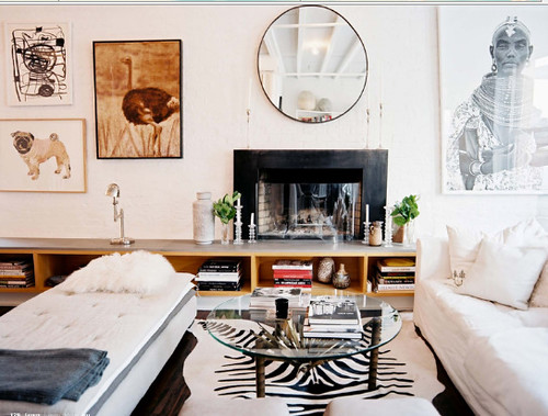
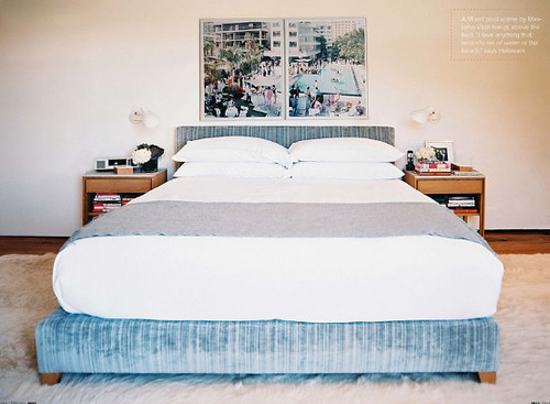
Ben: I think it's cool. Everything but the bed.
Me: Daybed.
Ben: Still. At my age, just seeing a bed makes me sleepy. I'd probably fall asleep, and that would be quite the conversation killer.
Me: Yes, it would, but I wouldn't let you do that. You know, I'm not sure WHY I like this room, or really if I have that much emotion about it at all. I know it's photographed well, and that's probably the main draw for me.
Ben: Where's the tv?
Me: OK, moving on...
Ben: The bed appears very comfortable, but everything seems really crammed into the center.
Me: This is actually one of the few rooms in this issue I could seriously not handle living in. The "center aligned" effect is obviously done on purpose, but I can leave it. Well, I'd take the Massimo Vitali photos and bail.
*Term "Happy Clapper" coined by the brilliant and should-be famous, Raina.
Me: This is actually one of the few rooms in this issue I could seriously not handle living in. The "center aligned" effect is obviously done on purpose, but I can leave it. Well, I'd take the Massimo Vitali photos and bail.
*Term "Happy Clapper" coined by the brilliant and should-be famous, Raina.


