Inside a Design Mag Photographer's Head
A few weeks ago, the stars aligned, and I was able to meet professional photographer
. You may not realize it, but you've seen her work. Her photographs have been featured in Rue, Bon Appetit, and Remodelista to name a few.
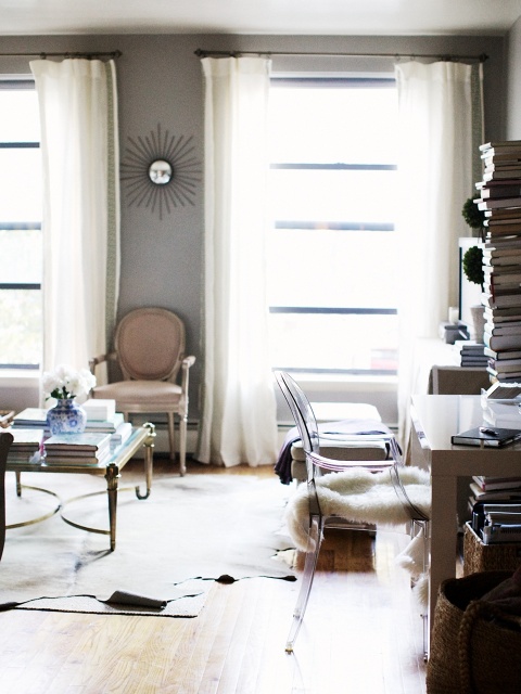
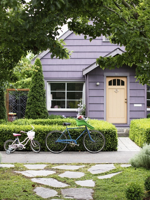
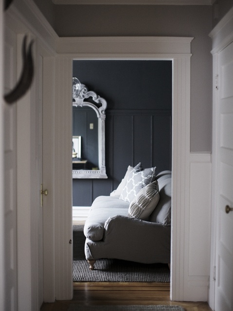
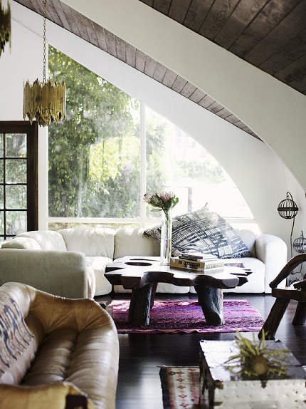
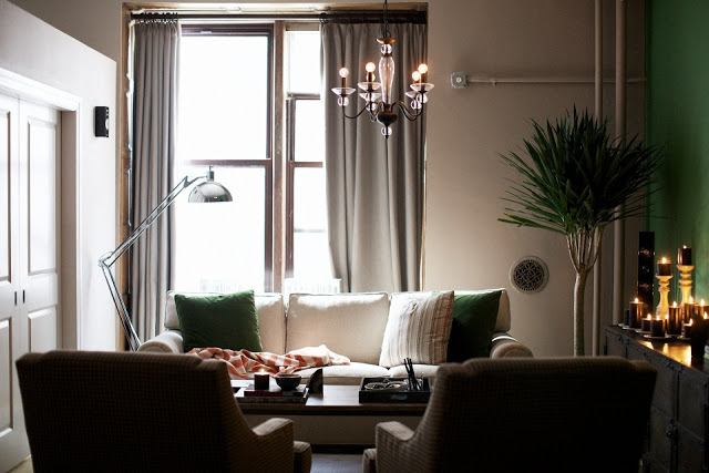
all photos by
(duh)
I'm a big fan of her work, especially how she lets the natural light tell the mood and story of a space. I have a geek-like interest in interior photo shoots; how they come together, how they're edited, and most importantly, how we all can make our homes "shoot-worthy."
Thankfully, Emily is as kind as she is talented, and let me throw together a little Q&A to help give me a little creative fly-on-the-wall perspective.
Enjoy the morsels!
<!-- /* Font Definitions */ @font-face {font-family:Times; panose-1:2 0 5 0 0 0 0 0 0 0; mso-font-charset:0; mso-generic-font-family:auto; mso-font-pitch:variable; mso-font-signature:3 0 0 0 1 0;} @font-face {font-family:"MS 明朝"; mso-font-charset:78; mso-generic-font-family:auto; mso-font-pitch:variable; mso-font-signature:1 134676480 16 0 131072 0;} @font-face {font-family:"MS 明朝"; mso-font-charset:78; mso-generic-font-family:auto; mso-font-pitch:variable; mso-font-signature:1 134676480 16 0 131072 0;} @font-face {font-family:Cambria; panose-1:2 4 5 3 5 4 6 3 2 4; mso-font-charset:0; mso-generic-font-family:auto; mso-font-pitch:variable; mso-font-signature:-536870145 1073743103 0 0 415 0;} /* Style Definitions */ p.MsoNormal, li.MsoNormal, div.MsoNormal {mso-style-unhide:no; mso-style-qformat:yes; mso-style-parent:""; margin:0in; margin-bottom:.0001pt; mso-pagination:widow-orphan; font-size:12.0pt; font-family:Cambria; mso-ascii-font-family:Cambria; mso-ascii-theme-font:minor-latin; mso-fareast-font-family:"MS 明朝"; mso-fareast-theme-font:minor-fareast; mso-hansi-font-family:Cambria; mso-hansi-theme-font:minor-latin; mso-bidi-font-family:"Times New Roman"; mso-bidi-theme-font:minor-bidi;} .MsoChpDefault {mso-style-type:export-only; mso-default-props:yes; font-family:Cambria; mso-ascii-font-family:Cambria; mso-ascii-theme-font:minor-latin; mso-fareast-font-family:"MS 明朝"; mso-fareast-theme-font:minor-fareast; mso-hansi-font-family:Cambria; mso-hansi-theme-font:minor-latin; mso-bidi-font-family:"Times New Roman"; mso-bidi-theme-font:minor-bidi;} @page WordSection1 {size:8.5in 11.0in; margin:1.0in 1.25in 1.0in 1.25in; mso-header-margin:.5in; mso-footer-margin:.5in; mso-paper-source:0;} div.WordSection1 {page:WordSection1;} -->
Q: Your interior photographs have a unique (um, amazing) aesthetic - they're not falsely lit, and convey a very true "mood" of a space. How would you describe your interior photography style?
I think I would describe my style as authentic and atmospheric.
Q: I think I speak for many when I say it is a goal to have my design projects published. In your experience, how are most published homes "scouted?"
Great question! I like to pitch homes I've photographed to publications where I feel they'd be a good fit. I know editors are always looking for great spaces to feature.
Q: I've always wanted to be a fly on the wall of interior design photo shoots. Partly from a styling, partly a photographer wanna-be perspective. (I'm nerdy like that) What do you try to capture when you photograph interior spaces?
I always look to capture the way it feels to be in a space. I'm looking for the images that capture the way a room struck me when I walked in. The colors, the scale.
Q: In your opinion, what is more appealing to photograph, a perfectly-decorated home, or a highly personal home? Why?
Definitely a personal home! A skillfully assembled collection of furnishings can be beautiful, but for me there's nothing like a room that's full of objects that carry memories and secret histories.
Q: We all see what appears to be perfect spaces in design publications - online and paper glossies. Are the interiors you photograph ever as "perfect" as they appear?
Rarely... often all signs of daily life are removed, and curated "lifestyle" scenarios are recreated in their stead. Can you tell I'm a fan of imperfections?
Q: I think we can all agree that a space can be beautiful, but if it is poorly photographed, the loveliness is often diminished. Do you have any tips to offer the blossoming designer on photographing their work (other than hiring a professional)?
The power of good composition is an often-overlooked factor in interior imagery. Think about what you want in the frame, and what you don't, and play with moving objects and furniture a little bit to one direction or another. Also, leaving a little bit of strategic negative space in the image makes for a pleasing balance -- try framing things off-center!
Thanks again, Emily!


