Oh yeah, we're Keeetchin' ReeenOvaTORS
Well, I have a lot of catching up to do. With Insta giving the 1000-words-in-a-snap synopsis, it might be redundant to blog, but I'm feeling optimistic.
When we bought this house, we hoped to do quite a bit to bring it up to speed. It was, for the most part, totally livable, just not the style we would choose. For example, over the past few months, we've had the basement completely renovated from a dark, cold cave to a warm, usable space. Hopefully, I'll get around to detailing that, but today is about the KEETCHIN.
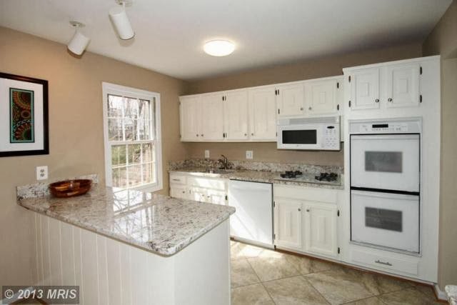
To preface: I have some guilt over redoing this kitchen. The people we bought the house from apparently prepped the kitchen for selling purposes - painted, and put it new granite. They put a fairly nice face on what was still a 1970s builder-grade kitchen.
Just a note of opinion, here, while I'm at it: Why do people renovate only to sell their home? Why not put in the nice features to enjoy them
while you live there
? As a buyer, I'd rather you leave the old stuff, and knock a few grand off the asking price, so I can make my own selections when it comes time to remodel. Sans the guilt of feeling wasteful.
So, yes, I feel guilty busting out a kitchen someone else thought was the bee's knees.
We've lived with it for about six months to really get a feel for what did and didn't work for us in the space. It's a decent-sized kitchen, but didn't maximize the space. There's the working wall of all the appliances, which left little counter/prep space. Then, there was the fridge and pantry - pushed into a small walkway outside the main part of the kitchen.
Strange.
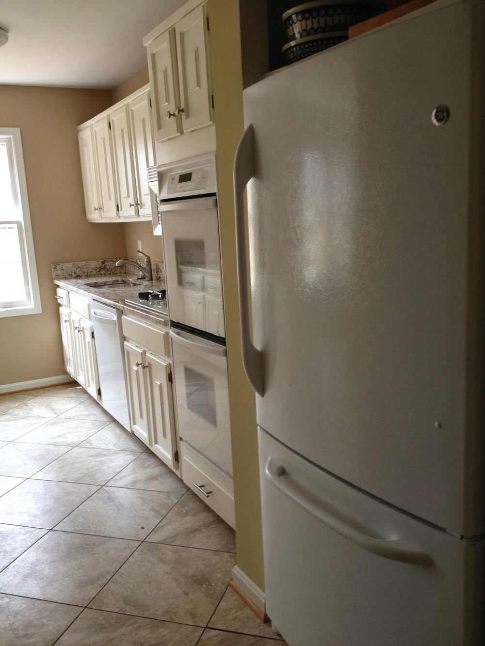
The little side bar area (on right in pic) wasn't deep enough for any small appliances, nor were there any outlets. Basically, nothing more than a catch-all for all for the papers, lunch boxes, etc that traffic through here.
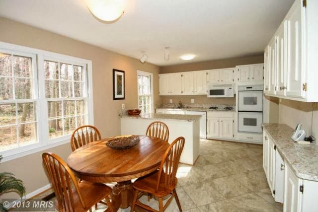
I liked the idea of having an eat-in area, but a round table (staged for selling) ate up a ton of real estate.
After visiting with our contractor about the feasibility of moving appliances around, I came up with a rudimentary sketch that included plans to replace the double ovens with a single range, move the fridge into the main kitchen area, and add additional counter space with the sink placement under the window.
The area vacated by the fridge in the passage-way would become a coffee station, with storage underneath for heavy small appliances (cuisinarts, etc), and the pantry would rotate to be accessible from the main kitchen.
We needed the storage the side cabinet provided, but planned it to be more of a standing desk/computer situation.
It'll be a tight fit, but we plan to put in a petite banquette/table along the back wall.

...Cabinet company rendering
I've been inspired by the greige kitchen movement. I want ours to be classic - with touches of brass, nickel, white and black.
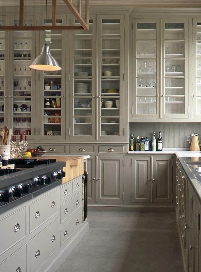
Well, you know - in a non-Martha/realistic version.
My working design board...
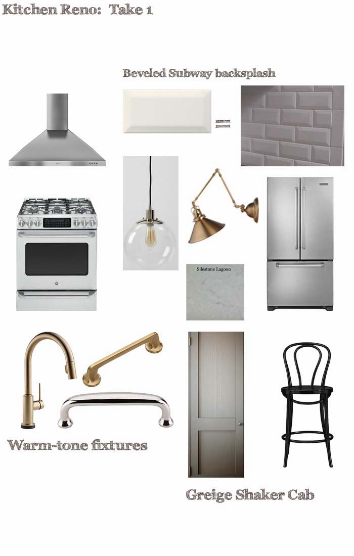
Some decisions are still in flux, but we're going with a shaker-style cabinet in a warm, mid-tone greige. I think the color is actually called mushroom. Or is it stone? Not sure.
We're about nine days in, have endured demo, and living with the essentials in a mock-kitchen. Amazing how complete you can feel with an espresso machine and a hot plate.
And. There's progress to report.
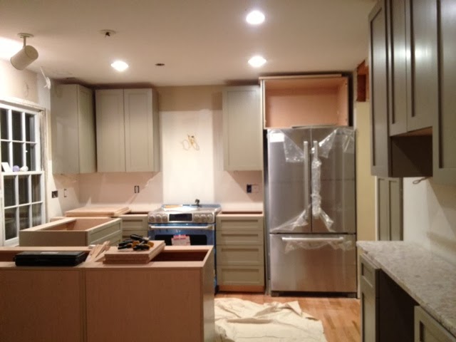
So it's a good day to blog.


