Curb Appeal
For the first two years in our home, we spent most our time, energy and budget on changes to the interior. We did a lot of reclaiming of yard from the parkland that borders our property, and did some landscaping, but, for the most part, the exterior of the house sat untouched.
I've made no bones about the fact that this house was not love at first sight - but I've always thought it had potential, and craved some personality, and that describes the exterior as well. It's nicely situated higher than street level, and sort of begs to have presence. I always strive to take a house to its best potential, and that has been the driving force in me with this house - the unmet potential.
The style of our home is traditional - a typical colonial revival dating to the 1970s, built with brick and metal siding. The siding was faded, and needed to be cleaned, but otherwise, it was in good condition (i.e. no hailstorm dents, etc) I can't even tell you how many door-to-door salespeople we've had trying to sell us vinyl siding! Replacement just didn't seem necessary, and the control freak in me didn't want to be limited in my color selection when it came time to update the exterior.
This is the house as it looked when we bought it
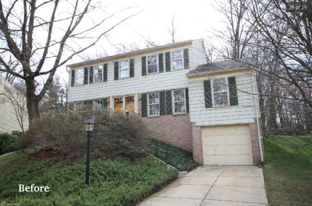
Since the siding was in decent shape, we felt like a fresh paint job would bring out the features, adding some much-needed curb appeal.
So, we hired a local company that specializes in painting siding. We discussed general color options, noting the benefits of going with a higher-contrast color combo, like medium-to-dark siding, with a darker color for shutters, and true white for the trim. I knew I wanted to stay out of the true beige arena, but the brick on our house tended to pull me in that direction until I decided to ignore the brick altogether, and go with what I liked!
Additionally, I think there is a pressure among homeowners in Virginia to stay true to historic colors, which I feel is warranted and appropriate with homes with historic lineage. Since our home is a loose interpretation of the Colonial style, and decidedly not historic (Helllo 1970s!), I put emphasis on color combos that were appealing, but not necessarily historically accurate.
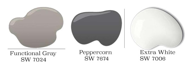
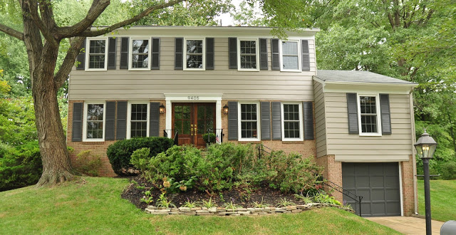
We ended up choosing Sherwin Williams colors: Functional Gray (as it turns out, a perfect "greige") for the siding, Peppercorn for the shutters and garage door, and Extra White for the trim.
...and here's how it turned out
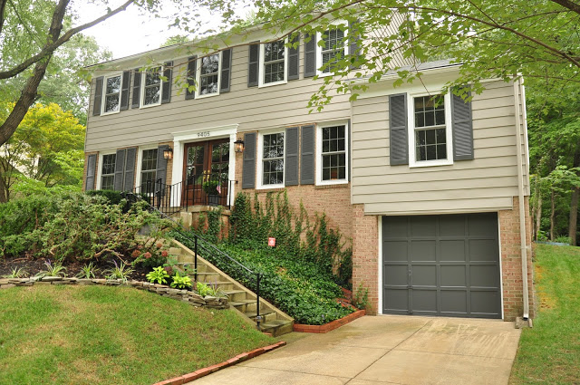
I can't get over the change. I keep driving up wondering if it's my house!
Now, to be fair, we replaced other features as well. The most dramatic being the front doors. We were fortunate enough to start off with an opening for double doors, and I really wanted to let in as much light as possible. We decided to forgo storm doors, and replaced them instead with custom glass paneled doors from Jeld-Wen. We stained them a rich mahogany to work with the traditional exterior.
We still felt like there was something lacking architecturally, so we added a crossbeam above the pilasters to bring interest, and act as the canvas for fresh, modern house numbers.
The last bit of change was to switch out the small, brass-plated sconces with larger lantern fixtures in an iron finish. Similar to these from Lampsplus. We put flame-style bulbs in the sconces, which add a nice vibe at night that resembles gas flame.
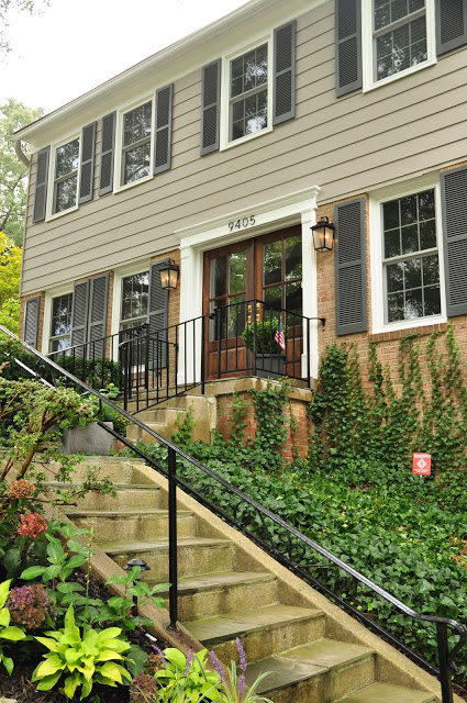

I never ceased to be amazed by the power of paint! I no longer feel like our house has the blahs, but instead is one of the happiest houses on the block!


