Project Reveal: Shavano Park Kitchen
It’s no surprise to say that everyone loves a kitchen remodel, so it only makes sense that our first completed client project since relocating to San Antonio is a remarkable update of a kitchen. The Before & After images might make you wonder if it is indeed the same home!
Project Background: We were hired in late 2021 to create a fresh kitchen design in an early 2000s-built home. Our client craved a space she and her family would love to spend time in, and she was inspired by our work, and that of British kitchen designers.
Project Goals: To improve functionality to meet the family’s needs. To design a space that was not “cookie cutter,” but was distinct, yet timeless.
Project Challenges: Angled walls and an asymmetrical space.
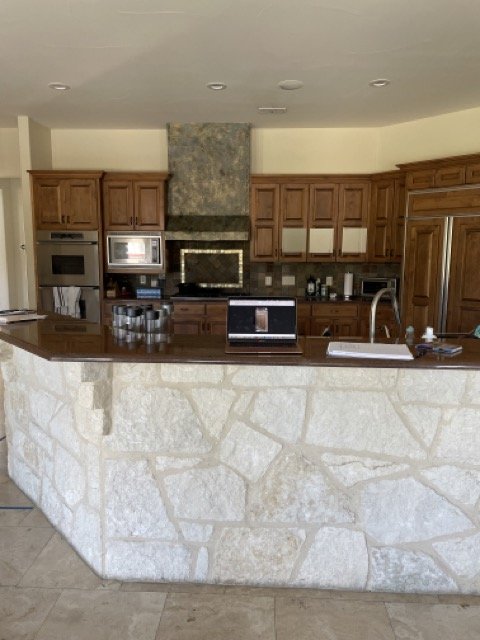
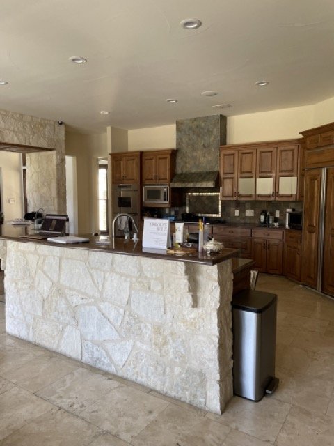
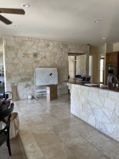
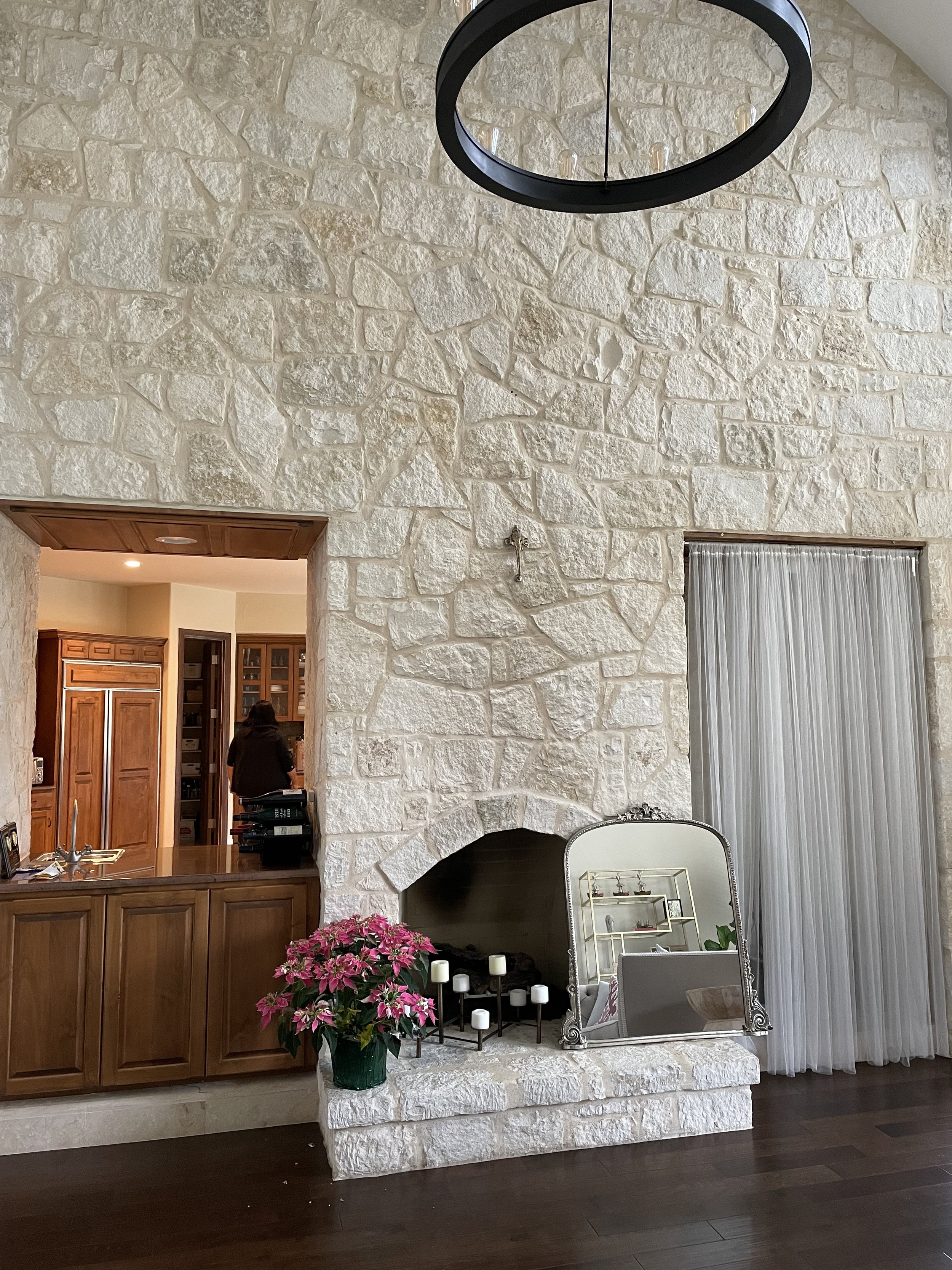
Existing Conditions: The images below depict the kitchen and shared living room wall at the time the project began. The range and refrigerator sat on an angled wall that could not be altered within the construction budget. A large, angled, two-level island sat awkwardly in the space. The wet bar existed as a pass-through to the living room, while a media cut-out on the living room side did not go through to the kitchen. There was an abundance of limestone on the walls and floors.
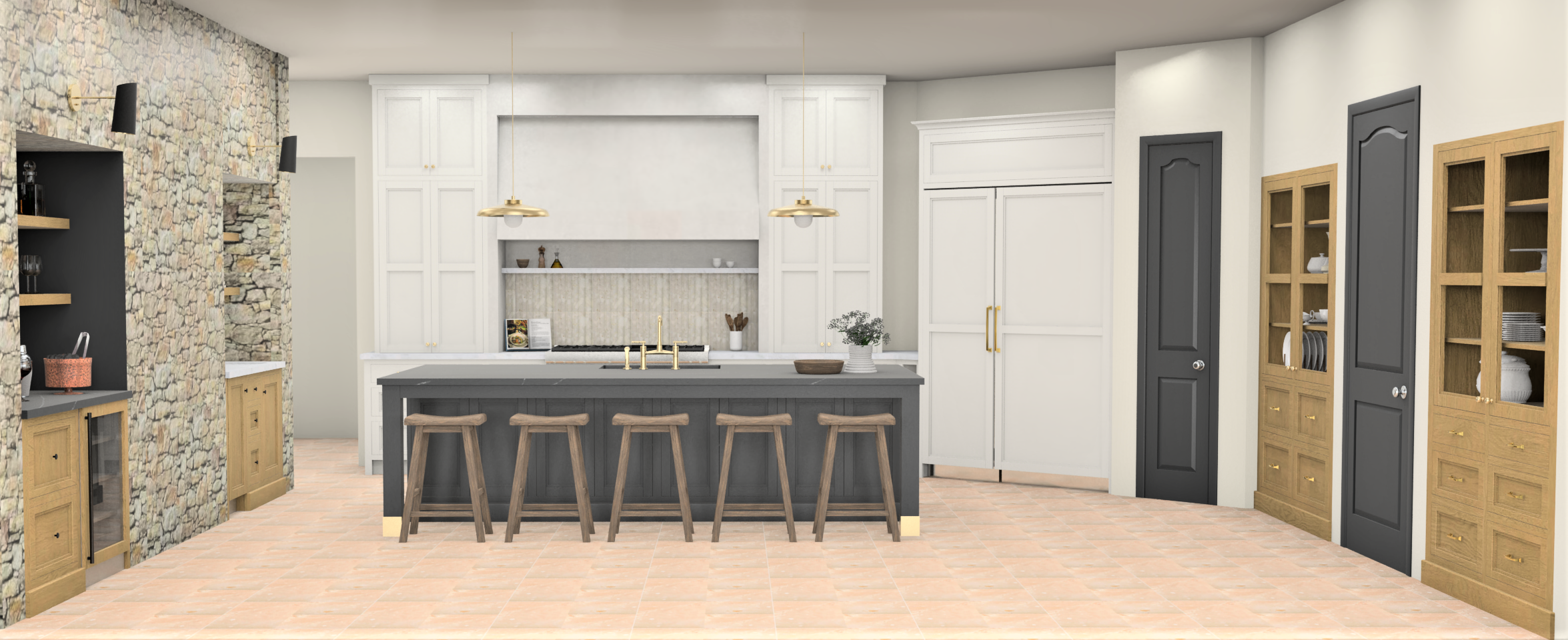
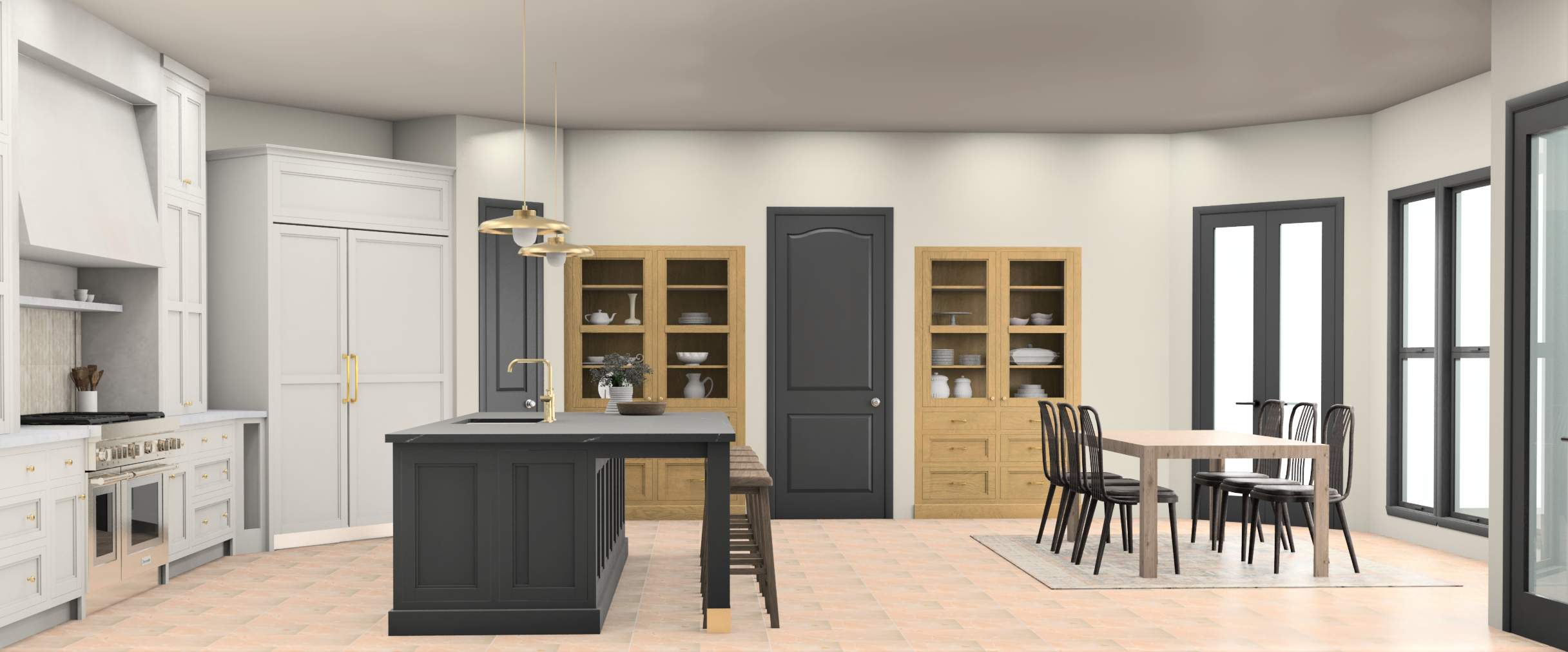
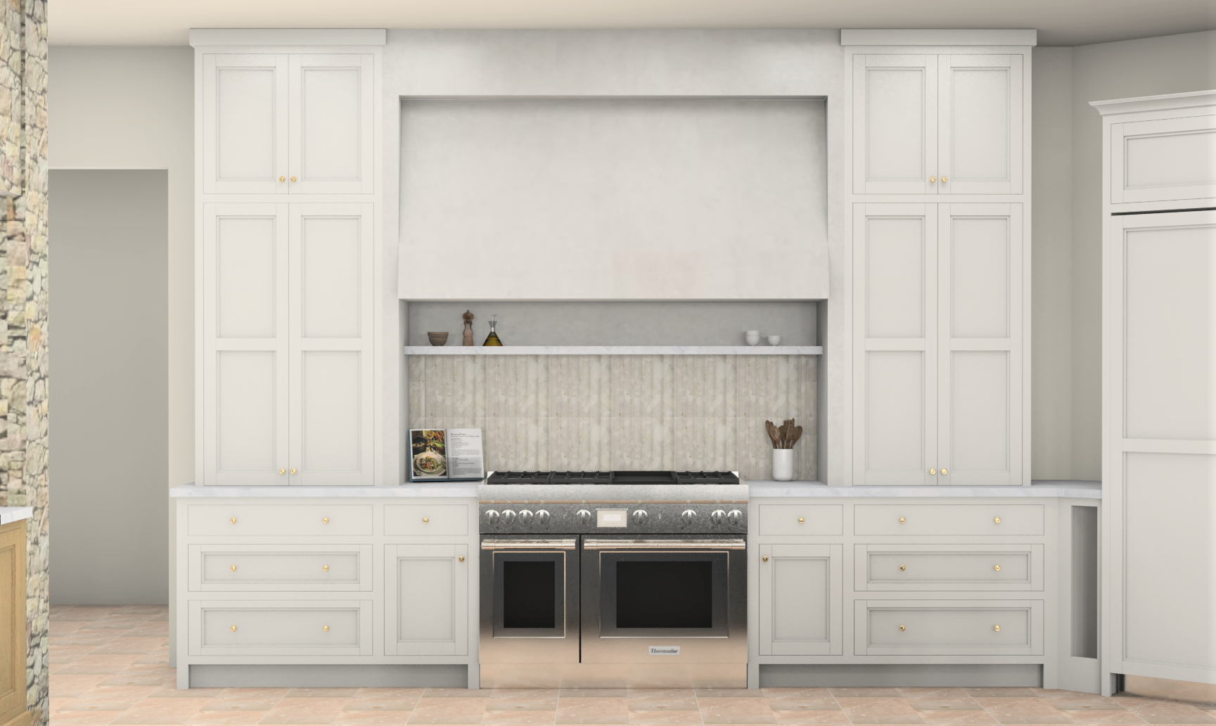
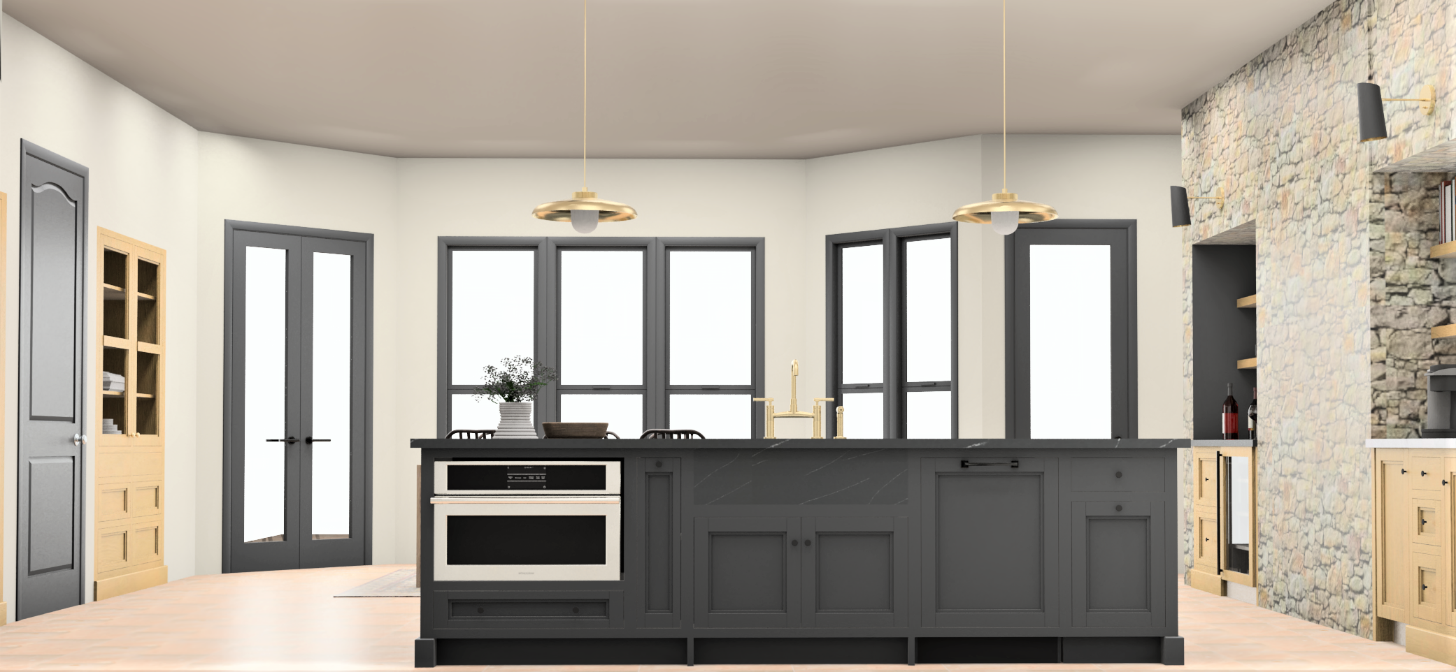
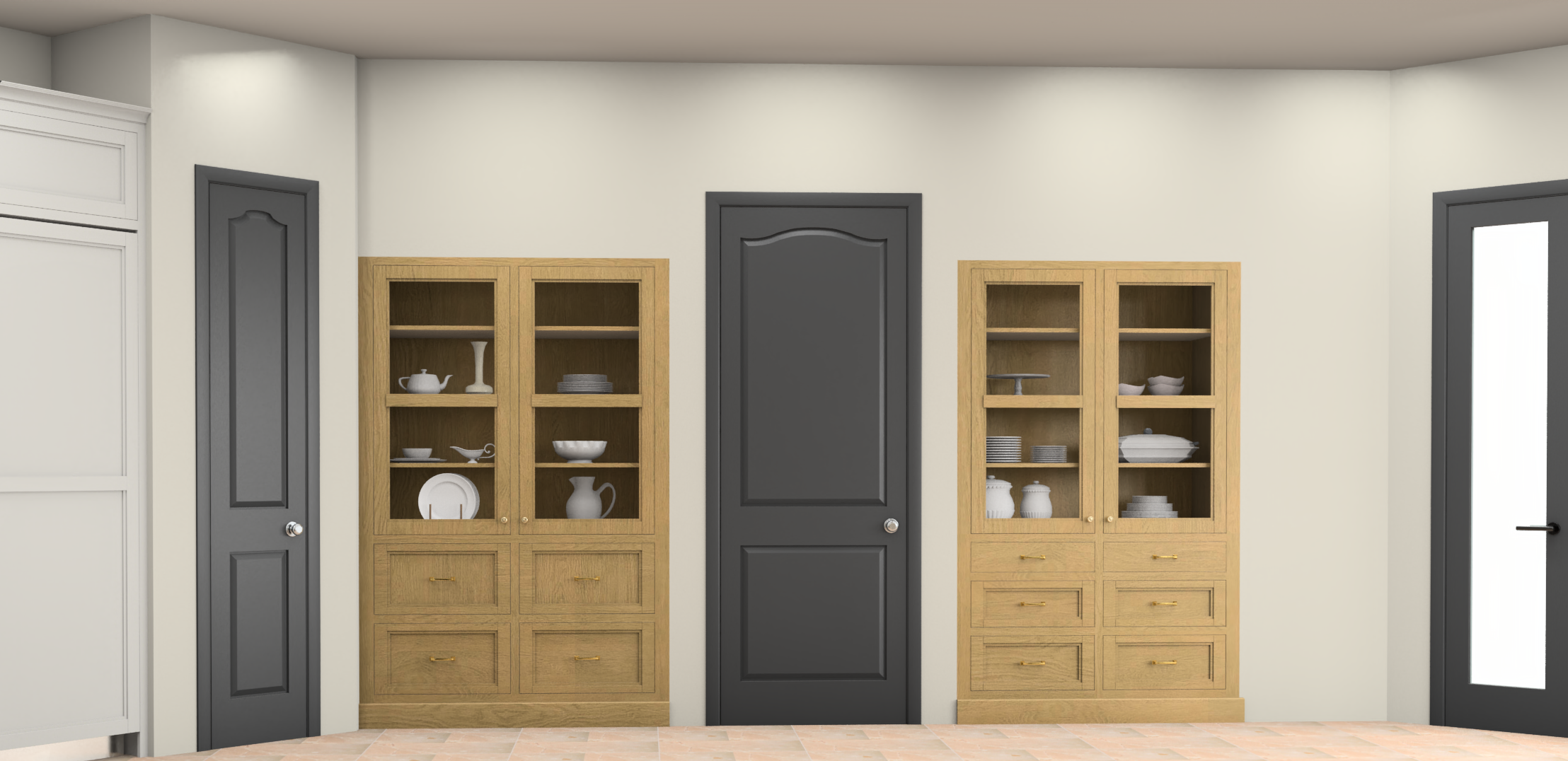
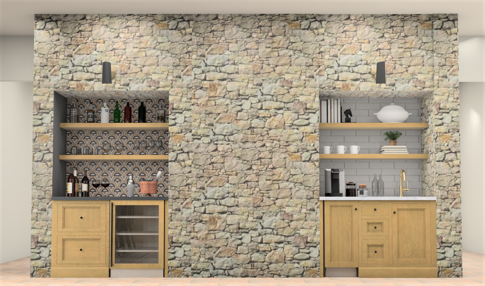
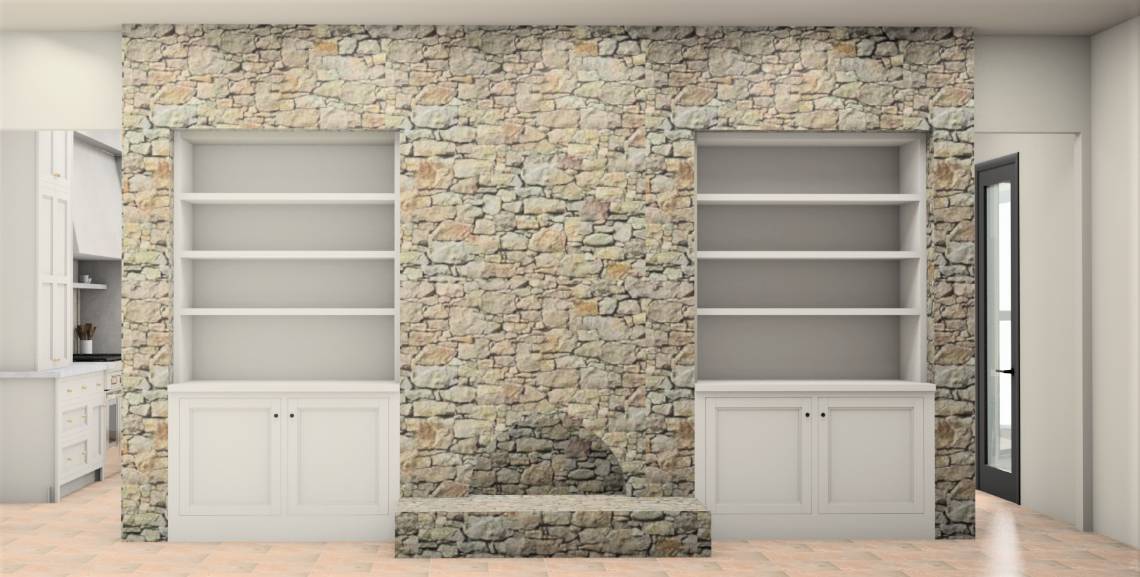
The design: Our design centered around the desire to create symmetry by centering the range on the back wall, and flanking it with a pair of tall hutch-style cabinets. A large, one-level island would provide plenty of gathering and serving space for the family, and hosting events. Additional functionality and symmetry was planned by a plan to divide the bar cut-out and create a coffee/smoothie station, and open a matching cut-out on the left to house a bar cabinet. Further cabinetry was designed on the opposite wall to act as specialty dish display and storage.
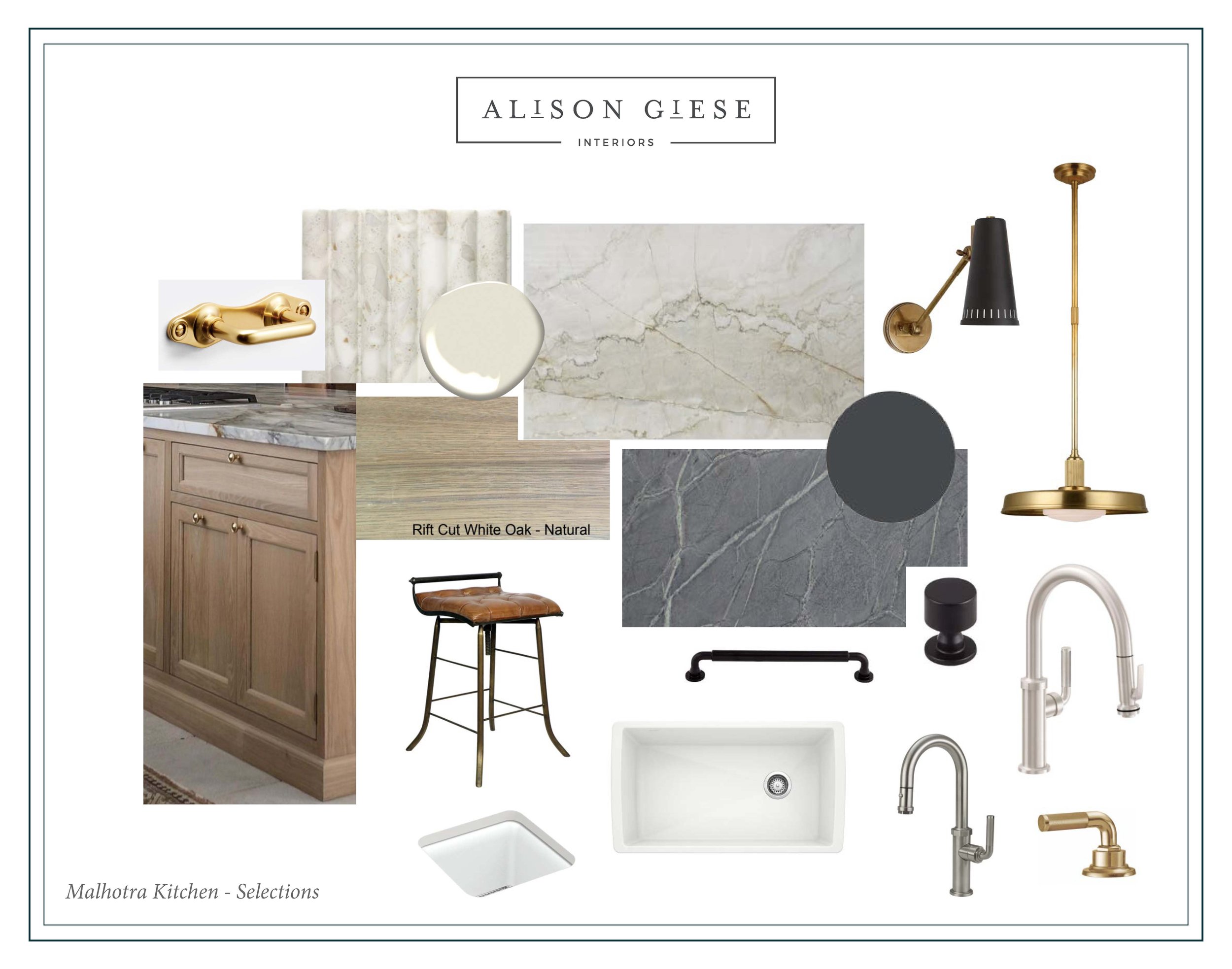
Scroll the following carousel for the design board and renderings that depict the newly-envisioned space.
The Materials: We wanted to incorporate much of the existing limestone in a way that felt visually lighter, and still honored the architecture of the home. A palette of light putty, inky blue, and natural, rift-sawn white oak were chosen for their timeless appeal. A mix of unlacquered brass and polished nickel were complementary and classic finishes.
The Result: A kitchen that feels like it has taken a deep, cleansing breath! Beautiful custom cabinetry to meet all our client’s needs for storage, and a design that is personal to our clients. We couldn’t be happier for them!
“I would highly recommend Alison Giese interiors without any hesitation. This was a demanding project. From the initial design to final execution of the project - Alison couldn’t have
handled it better. She was calm , clear , detail oriented and advocated for us every step of the way. Finding a designer - who truly puts her clients first - every step of the way - is an incredible gift. We are very grateful.”
Photography: Kerry Kirk Photography
Build: DRVN Services
Planning a kitchen remodel, and don’t know where to start? Our Kitchen Remodel Guide will take you through the elements you’ll need to create a cohesive, functional space. Ready to relax and let AGI take the burden of decisions and design off your plate? Contact us to learn about our process and availability.


