Project Reveal: Master Bedroom Oasis
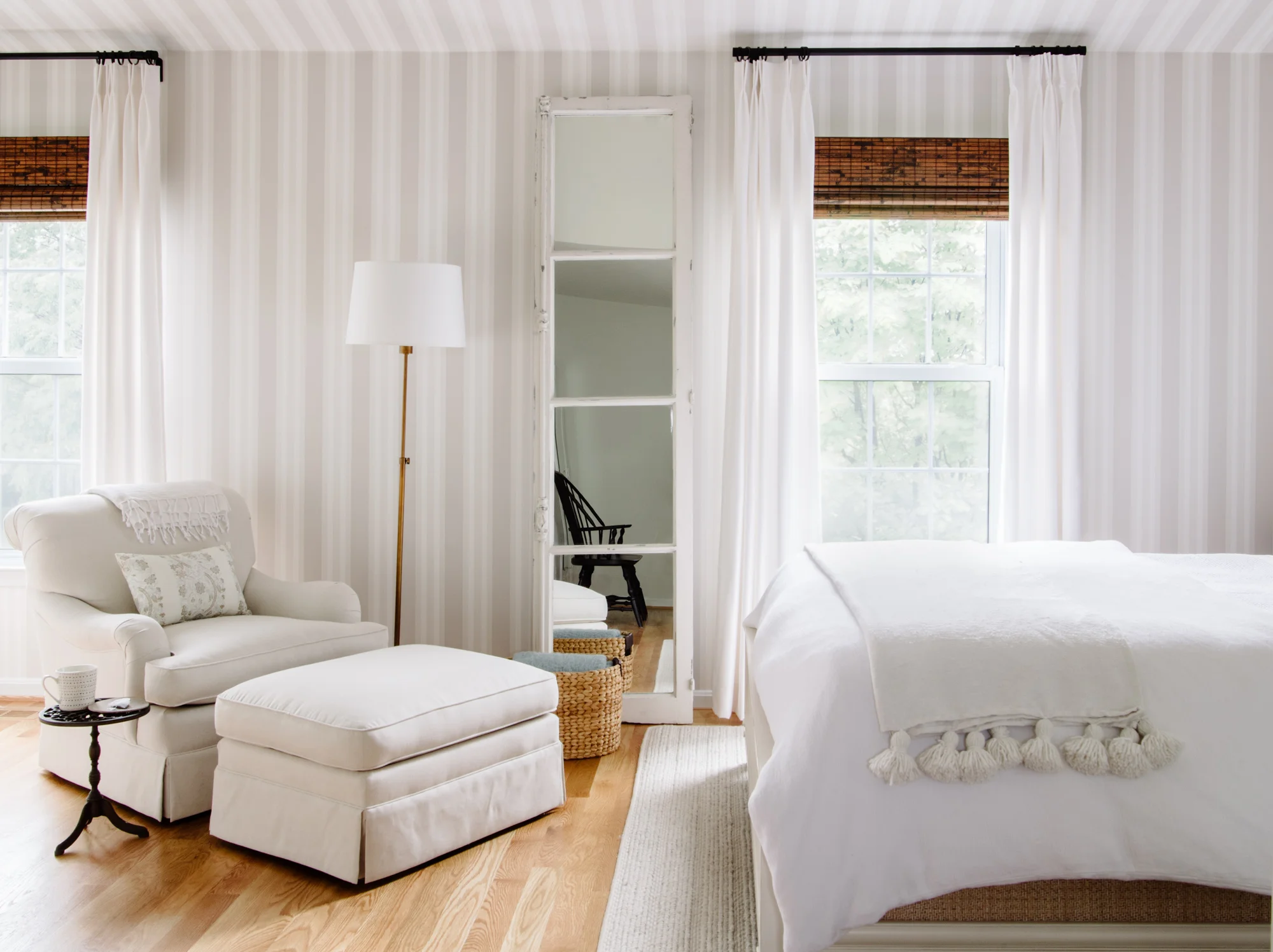
Late last year, a couple approached us about working together to update their guest bathroom in time for holiday guests. As we moved into the new year, we continued to work with them to rework their master bedroom. The room presented with a sloped ceiling, and an asymmetrical floorplan that made furniture placement challenging. They wanted a space that felt fresh, but more importantly, needed it to function as a place of sanctuary and relaxation.
We first dealt with the floorplan, which required us to take away a tad of space, in order to gain symmetry and function.
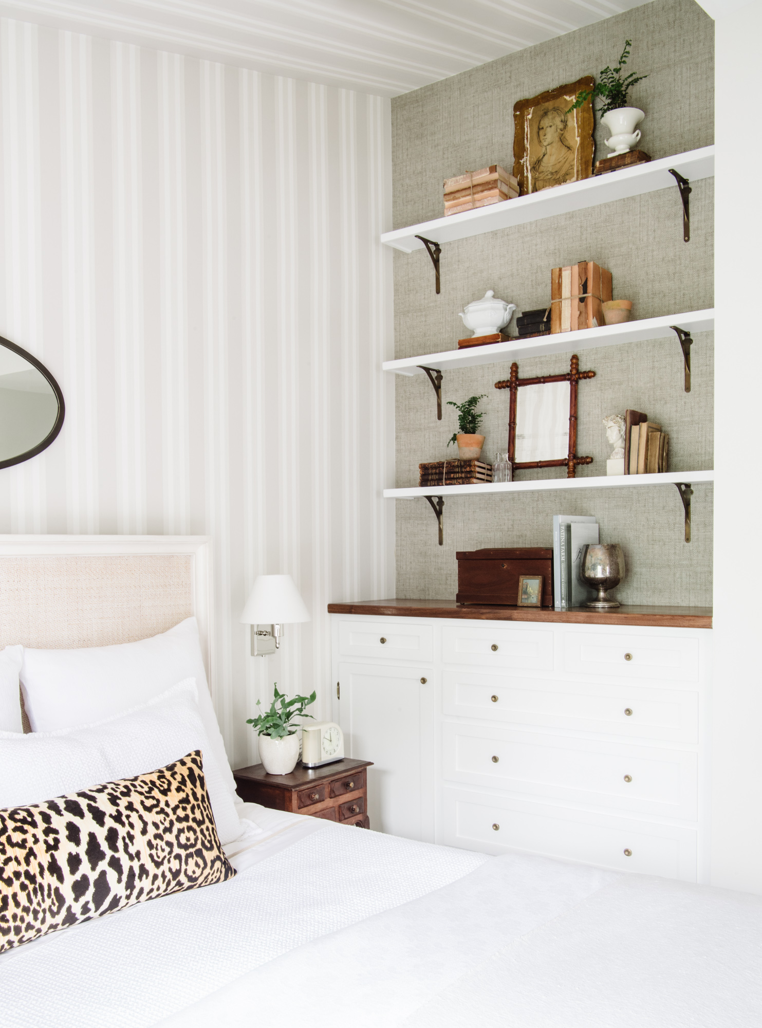
Then, we moved to selecting fabrics and finishes to create a fresh update. We chose light neutrals with plenty of texture, and hardworking performance fabrics. We kept the palette balanced with touches of warm wood on the built ins and side tables. A focal point came in the form of a striped wallpaper in a subtle colorway, to take advantage of the sloped ceiling, and create a tented effect. With a place for a reading chair, the space feels very destinational - the perfect retreat for relaxation!
photos: Robert Radifera
For more info on selections and sources, see our feature on the Homebunch blog.
To view more of our portfolio & inquire about your next project, click below!


